Yesterday, I fell and twisted my ankle…or twisted my ankle and fell. So, I spent most of the day laid up on the couch with an ice pack, listening to an audio book (Aurora’s End) and tending my Calibre library, which is where I keep track of my non-Kindle books. (I really wish Amazon hadn’t changed file formats to prohibit being uploaded to Calbre. That way I could have them all in one place. But that’s beside the point.) Yesterday, I made sure every book had a listed page length and, if it was part of a series, that series was listed, along with the books place in the series.
This is something I’ve wanted to do for a long time, but didn’t want to dedicate several tedious hours to. In this case, I was stuck on the couch anyhow. So, I was glad for a task that was mindless enough to do while following an audio book. And I feel super accomplished!
I’m likely to spend much of today similarly immobile. This morning I’m looking at covers. And I’ve come to the conclusion that I have definite opinions about such things. I realize, of course, that my opinion is just that. I don’t expect to suddenly get my own way in all things, even this small thing. But, as I have little else to do at the moment (and in case it make any difference to hear a reader’s opinion), I’m going to tell you about it.
I want to talk about the covers of box sets/anthologies/omnibuses/etc. (I’m going to use the term box set to include all of these.) Well, as an aside I also want to take a moment to yell at the top of my lungs ALWAYS PUBLISH A BOOK’S PAGE LENGTH! I don’t care if it’s a digital book. It annoys the ever living FUCK out of me to try and discover if I’m picking up a short story or an epic and only find “File size: 3031 KB.” But that isn’t what today’s post is about. Today is about book cover conventions for box sets.
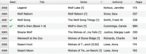
I find that a lot of authors use 3D rendering of the books in the set instead of a flat cover. I 100% hate this. I don’t actually hate the renderings. I think they’re pretty and make great promo tools. But they are pictures of a box set, not a cover of a box set. (See the difference?) Let me show you why I feel the way I feel. Here’s an image from my Calibre library (ordered by length). I could have done the same in Goodreads, but, as I said, I’m working in Calibre.
You see, everything matches in size and shape. There’s a flow and then, BAM you hit those box sets. They’re the wrong shape, all that white space stands out, and they break up the symmetry. They basically stand out for all the wrong reasons. This annoys me more than is probably reasonable, but enough that I’m taking the time to write a whole post about it.
I actually feel the same way about authors who don’t stick to the size and shape conventions for book covers in general too.

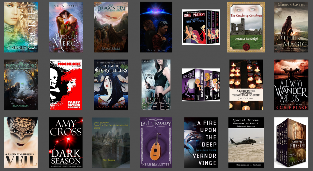
That book in the middle isn’t an audio book. It’s just a book with the wrong shaped cover and it stands out horrendously. To me, books that don’t conform to the industry convention for cover shape scream ‘poorly done self-publishing.’ I actually hate to say anyone has done something wrong, because part of the joys of self-publishing is the ability to do things differently if you choose. But, for me, allowing readers to maintain ascetic cohesion when they are looking at their digital shelves is important. Again, it’s just my opinion. But it’s one I feel strongly about.
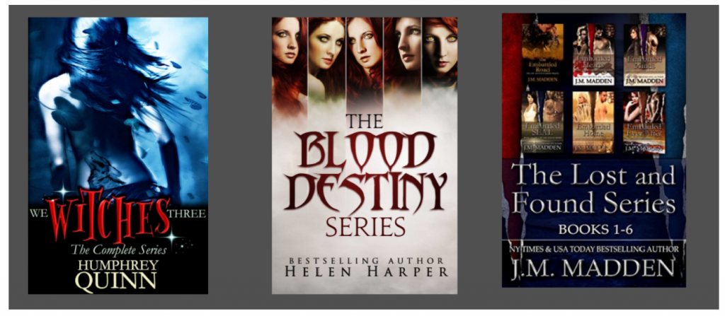
Going back to box sets. I don’t actually care If the cover is one created for the set and just lists the series name (like cover one), has stylized rendering of the books (cover 2), just has all the covers of the books themselves (cover 3), or something else entirely.
Just so long as the overall image is rectangular and flat, so that it matches other books on my shelves.
And in case you needed one more reason to stick to flat covers, let me mention #Bookstagram. I love Instagram. I post a ton of book pictures. So many, in fact, that between See Sadie Read and Sadie’s Spotlight, I have two accounts full of almost nothing but books. (The latter entirely ebooks.) I recently posted this one.
View this post on Instagram
Nowhere, absolutely nowhere (not on Amazon, the author’s page, or Goodreads) can I find a flat image of this book cover. And while this was an ARC, the book has been published with this as it’s cover. Tell me how much nicer that picture would have looked with a flat image of the cover! It’s got a super pretty cover. I’d have much preferred a real image of it.
So, there you have it folks, my unequivocal opinion on the size and shape of digital box sets. Am I alone in this? Anyone feel differently?