Author Archives: Sadie

Creating Some Shelf Space

I am creating a new reading challenge for myself, a two-part one. I have several long-term ones running at the moment. So, what I obviously need is one more. But I’ve been meaning to do this for a while, and it’s time.

My physical book shelves are out of control; completely overflowing their bounds, and this is entirely my own fault. I am really bad about putting a book on the self and then—out of sight, out of mind—totally forgetting about it. I end up reading almost entirely from newer books that are fresher in mind and older books sit around getting older.

So, what I did this morning was pick out five of the oldest books I’ve won over the years (be it from Goodreads, author websites, twitter, whatever). Some of them I’ve owned long enough to have packed and shipped them to England AND BACK with our international moves. It’s time to get them read and reviewed.

This turned out to be:

five oldest won books

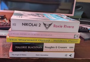
  • Nikolai 2, by Roxie Rivera (I reviewed book 1 here)
  • A Weak American in Russia & Ukraine, by Walter Parchomenko (which seems especially timely given the state of Russia and the Ukraine right now)
  • Broken Point, by Donna K. Childree & Mike L. Hopper
  • Noughts & Crosses, by Malorie Blackman
  • The Angel of History, by Rabih Alameddine

Then, since physical shelf space is what is lacking, I grabbed the longest, most epic of epic books on the shelf. I accomplished this with the super scientific method of looking at the shelves and pulling out the fattest ones.

longest

For the epic stack I pulled out six books. (I suppose, technically, Nikolai could cross over and fit either stack.) But the six I’m counting here are:

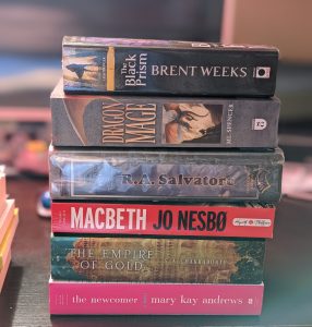
  • The Black Prism, by Brent Weeks
  • Dragon Mage, by M.L. Spencer
  • The Icewind Dale Trilogy, by R.A. Salvator
  • Macbeth, by Jo Nesbø
  • The Empire of Gold, by S.A. Chakraborty
  • The Newcomer, by Mary Kay Andrews

And of course, The Empire of Gold is actually 3rd in its series. So, I’ll need to read the previous books first.

This is obviously a challenge that will take a while. I can’t even dive into it right away. I’ve committed myself to several reviews with deadlines that I have to get done first. But I’ve pulled the books from the anonymity of the general book shelf, which means I’ll hopefully remember to grab them when looking for my next read.

Plus, I’ve been reading a lot of short stories lately. Which Goodreads just counts as a book. So, I feel like my Goodreads Challenge numbers are inflated. Reading some epics will balance the scales a little. Right?

I figure this aught to keep me busy for a while and free up a collective 2-foot, or so, of space. Success!


Edit: I’ve decided to simply add links to the reviews as I finish these books, rather than do a separate wrap-up post.

aurora's end banner

Book Review: Aurora’s End, by Amie Kaufman & Jay Kristoff

I borrowed an audio copy of Aurora’s End*, by Amie Kaufman and Jay Kristoff through my local library. I reviewed books one and two, here.
Aurora's End audio cover

Is this the end?

What happens when you ask a bunch of losers, discipline cases, and misfits to save the galaxy from an ancient evil? The ancient evil wins, of course.

Wait. . . . Not. So. Fast.

When we last saw Squad 312, they were working together seamlessly (aka, freaking out) as an intergalactic battle raged and an ancient superweapon threatened to obliterate Earth. Everything went horribly wrong, naturally.

But as it turns out, not all endings are endings, and the team has one last chance to rewrite theirs. Maybe two. It’s complicated.

Cue Zila, Fin, and Scarlett (and MAGELLAN!): making friends, making enemies, and making history? Sure, no problem.

Cue Tyler, Kal, and Auri: uniting with two of the galaxy’s most hated villains? Um, okay. That, too.

Actually saving the galaxy, though?

Now that will take a miracle.

my review
I didn’t dislike this, but I also didn’t enjoy it anywhere near as much as the first two books (especially book one). Fin was one of my favorite characters and I admit to wishing he got more screen time here (in the book with him on the cover).

Similarly, what I so enjoyed about book one was the interplay between all of the characters. Here, they’re split into three grouping and don’t come together until the very end. I appreciated how each of their storylines wrapped around and became pertinent to the ending. But I missed seeing them all together, missed their humor and sarcasm.

Lastly, I was simply bored for the first half of this book. The second half had a bit more going for it (and even made me cry a little). But being bored for the first 5 or 6 hours of an audio book is hard to overcome. Plus, I thought the solution to the Ram problem was incredibly pat. I was not thrilled with the ending.

Having said all that, I did still like the overall sarcastic tone of the book, appreciated the amount of growth in the characters, and the narrative cast did a good job.

* Narrated by Kim Mai Guest, Johnathan McClain, Lincoln Hoppe, Donnabella Mortel, Jonathan Todd Ross, Erin Spencer, and  Steve West.

aurora's end photo


Other Reveiws:

https://cupsandthoughts.com/2021/12/04/non-spoiler-book-review-auroras-end-by-amie-kaufman-and-jay-kristoff/

please keep digital box set covers this

Please put flat covers on digital box sets, a reader’s request.

Yesterday, I fell and twisted my ankle…or twisted my ankle and fell. So, I spent most of the day laid up on the couch with an ice pack, listening to an audio book (Aurora’s End) and tending my Calibre library, which is where I keep track of my non-Kindle books. (I really wish Amazon hadn’t changed file formats to prohibit being uploaded to Calbre. That way I could have them all in one place. But that’s beside the point.) Yesterday, I made sure every book had a listed page length and, if it was part of a series, that series was listed, along with the books place in the series.

look complete we are

This is something I’ve wanted to do for a long time, but didn’t want to dedicate several tedious hours to. In this case, I was stuck on the couch anyhow. So, I was glad for a task that was mindless enough to do while following an audio book. And I feel super accomplished!

I’m likely to spend much of today similarly immobile. This morning I’m looking at covers. And I’ve come to the conclusion that I have definite opinions about such things. I realize, of course, that my opinion is just that. I don’t expect to suddenly get my own way in all things, even this small thing. But, as I have little else to do at the moment (and in case it make any difference to hear a reader’s opinion), I’m going to tell you about it.

I want to talk about the covers of box sets/anthologies/omnibuses/etc. (I’m going to use the term box set to include all of these.) Well, as an aside I also want to take a moment to yell at the top of my lungs ALWAYS PUBLISH A BOOK’S PAGE LENGTH! I don’t care if it’s a digital book. It annoys the ever living FUCK out of me to try and discover if I’m picking up a short story or an epic and only find “File size: 3031 KB.” But that isn’t what today’s post is about. Today is about book cover conventions for box sets.

I find that a lot of authors use 3D rendering of the books in the set instead of a flat cover. I 100% hate this. I don’t actually hate the renderings. I think they’re pretty and make great promo tools. But they are pictures of a box set, not a cover of a box set. (See the difference?) Let me show you why I feel the way I feel. Here’s an image from my Calibre library (ordered by length). I could have done the same in Goodreads, but, as I said, I’m working in Calibre.

3d renderings of box sets don't fit in

You see, everything matches in size and shape. There’s a flow and then, BAM you hit those box sets. They’re the wrong shape, all that white space stands out, and they break up the symmetry. They basically stand out for all the wrong reasons. This annoys me more than is probably reasonable, but enough that I’m taking the time to write a whole post about it.

I actually feel the same way about authors who don’t stick to the size and shape conventions for book covers in general too.

make your cover match industry standard
That book in the middle isn’t an audio book. It’s just a book with the wrong shaped cover and it stands out horrendously. To me, books that don’t conform to the industry convention for cover shape scream ‘poorly done self-publishing.’ I actually hate to say anyone has done something wrong, because part of the joys of self-publishing is the ability to do things differently if you choose. But, for me, allowing readers to maintain ascetic cohesion when they are looking at their digital shelves is important. Again, it’s just my opinion. But it’s one I feel strongly about.

Going back to box sets. I don’t actually care If the cover is one created for the set and just lists the series name (like cover one), has stylized rendering of the books (cover 2), just has all the covers of the books themselves (cover 3), or something else entirely.

examples of box sets
Just so long as the overall image is rectangular and flat, so that it matches other books on my shelves.

And in case you needed one more reason to stick to flat covers, let me mention #Bookstagram. I love Instagram. I post a ton of book pictures. So many, in fact, that between See Sadie Read and Sadie’s Spotlight, I have two accounts full of almost nothing but books. (The latter entirely ebooks.) I recently posted this one.


Nowhere, absolutely nowhere (not on Amazon, the author’s page, or Goodreads) can I find a flat image of this book cover. And while this was an ARC, the book has been published with this as it’s cover. Tell me how much nicer that picture would have looked with a flat image of the cover! It’s got a super pretty cover. I’d have much preferred a real image of it.

So, there you have it folks, my unequivocal opinion on the size and shape of digital box sets. Am I alone in this? Anyone feel differently?